See more (“Up in the Air,” “Little Miss Sunshine,” “Madea Goes to Jail”) at The Auteurs, where Adrian Curry writes:
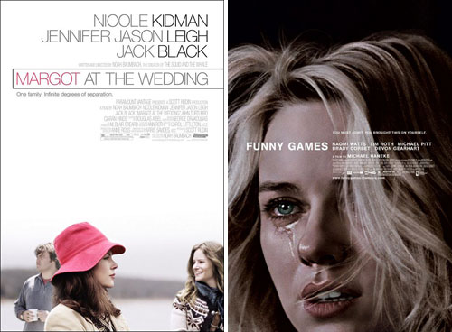
Two of my favorite posters of recent years, those for “Margot at the Wedding” (2007) and “Funny Games” U.S. (2008) both used versions of Helvetica to great effect. “Margot” used a stylish Neue Helvetica Thin in pink, with the actors’ names in the same size and type as the title, while “Funny Games” uses an unusually small point size for a movie poster title to great effect.
See “Why the Helvetica is Trajan the movie font?” from 2007.